
Open your platform's indicator menu. Several hundred entries. Overwhelming, mysterious, faintly magical.
Here is the sentence that demystifies all of them at once, and saves you five wandering years:
Every indicator ever invented is computed from the same price and volume data already on your screen.
No extra information exists in any of them. None sees the future. An indicator is a mathematical transformation of the past — price wearing glasses.
That's not an insult. It's the correct job description. Glasses don't add reality; they add focus — a good lens takes something true-but-hard-to-see in raw price and makes it visible at a glance. A bad lens (or seventeen stacked at once — you've seen those charts, you may own one) turns a readable page into a kaleidoscope.
So here is the master key you'll carry for life. For ANY indicator you ever meet, two questions:
One: what does this lens bring into focus?
Two: why would that thing matter to the humans making prices?
No answer to question two = decoration. Decoration costs money. Now watch the key work on the oldest, most-watched lens on Earth.
The moving average: average the last N closes, plot it, slide forward. The 20-day MA is the smoothed path of the last month; the 200-day, the last year. Question one is easy — it removes ripples and shows Dow's tide, machine-drawn.
Question two is where flashcard traders stop and we don't. Why would a smoothed line matter to the humans making prices? Because of what that line secretly is:
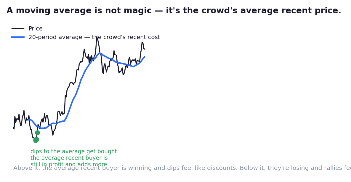
A moving average is, approximately, the crowd's average cost. The 20-day MA is roughly what the average participant of the last month paid. It's not a line. It's a price tag — the crowd's collective receipt, walking forward one day at a time.
Now think like the Psychology school for sixty seconds:
Price above the average → the average recent buyer is in profit. Confident. Relaxed. And when price dips back toward the average — toward their own cost — what do confident holders do at their receipt price? They defend it. They add. "Back near my price — discount." Their bids are why, in uptrends, the moving average behaves like moving support — why price kisses it and bounces, again and again (the figure).
Price below the average → the same crowd is in loss. Anxious. Waiting. Every rally back toward the line approaches their break-even — and Chapter 04 taught you exactly what crowds do at break-even. Their relieved selling is why, in downtrends, the identical line becomes moving resistance.
One line, two jobs — and the mechanism is nothing new. It's Chapter 04's scar tissue, made mobile: a memory level that walks. You've even met it on a leash: the Playbooks' dog-and-owner chapter. The owner finally has a name — the crowd's average cost.
Three layers to finish the lens:
The famous numbers are famous, and that's part of why they work. The 200-day MA appears in every market report on Earth — partly because a year of closes genuinely captures the tide, but substantially because everyone watches it: funds, algos, journalists, your uncle. Millions of eyes = real orders resting around the line = the line behaves. Shared belief IS structure in markets — the same self-fulfilling force that powers round numbers. (Its celebrity crossover, the golden cross — 50-day rising through 200-day — is famously late as a signal and famously punctual as a headline that summons buyers. Both facts are useful; just don't confuse them.)
Lag is the fee, not the flaw. An average of the past must trail the present — by construction. MAs will never sell you tops or buy you bottoms; they confirm tides and mark the walking crowd's receipt. Traders who rage at MA lag are angry at glasses for not being a telescope.
Length = which crowd you're reading. The 20-day tracks the swing crowd's cost; the 200-day, the investors'. Pick the average matching the crowd you actually trade against — then (Chapter 03's rule) stop shopping lenses until one agrees with you.
Your checklist doesn't gain a new question here — it gains a helper: the walking level joins your Chapter 04 map, and 'price reclaiming / losing the crowd's cost line' becomes one more way to read location and tide at a glance.
Next: the second great lens family — the one that measures not where price is, but how fast it's moving. That's where overbought, oversold, and divergence finally get their real explanations.
Key Takeaway
Indicators add focus, never information — demand a human rationale from every lens or delete it. A moving average is the crowd's average cost made visible: moving support while that crowd is winning, moving resistance while it's losing; the famous ones work partly because everyone watches. Lag is the fee for smoothing. A memory level that walks.
Think About It
Count the indicators on your chart right now. For each, complete the sentence: 'this matters to the humans making prices because ___.' Whatever fails the sentence — what exactly is it still doing on your screen?
Chart Lab — Meet the Receipt
Clean chart, one lens: the 20-day MA on daily Nifty. (Resist everything else.)
Walk back a year and mark every touch: where did price kiss the crowd's receipt and bounce (holders defending their cost)? Where did it slice through — and did the line then swap jobs, support to resistance?
Repeat once with the 200-day on the weekly: different crowd, different receipt, same psychology.
For each clean bounce, answer in writing: WHO was buying there, and why did their cost basis make them? When the line stops being geometry and becomes a crowd defending its receipt — this chapter is installed, and 'lag' will never bother you again. You'll know what the line is late to, and why that's fine.