
The oldest idea in technical analysis was never even written down by its author.
Charles Dow was a journalist — co-founder of Dow Jones, first editor of The Wall Street Journal, and inventor of the stock index (created as a journalism tool: one number so readers could see what 'the market' did today). He died in 1902, book-less; followers stitched his editorials into what we now call Dow Theory.
Its centrepiece is the best analogy in finance:
The market is an ocean.
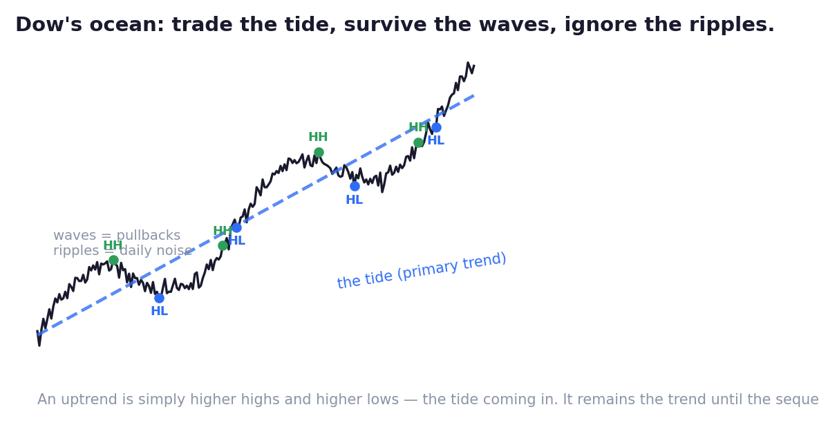
- The tide — the primary trend — the great movement, running months or years.
- The waves — pullbacks and corrections rolling against the tide for weeks.
- The ripples — daily noise, meaningful to almost nobody.
Anyone at the beach can describe the ripples. Only the patient observer — watching where successive waves reach on the sand — knows whether the tide is coming in or going out.
And that's exactly how Dow defined trend, in two lines a child can apply:
Uptrend: higher highs and higher lows. Each wave reaches further up the sand; each retreat stops short of the last.
Downtrend: lower highs and lower lows. Every bounce weaker, every low deeper.
No indicator. A pencil and honesty. Look at the figure: HH, HL, HH, HL — the tide, made visible by structure alone. Your map frame from Chapter 03 is where this structure lives; check it there before the street view, every time.
Now the three Dow insights that will actually protect your money:
One: trade the tide, survive the waves, ignore the ripples. Most traders drown in the wrong layer — panic-selling a healthy tide because one wave rolled back, or white-knuckling a monthly position over 15-minute ripples. Know which layer your trade lives in, and refuse information from the other layers. (The Playbooks' travelator? That's a tide compressed into one day — and 'never walk against it' is Dow, restated.)
Two: the tide has phases — and each phase belongs to someone. This is where Chapter 02's whales return, now at campaign scale. Dow's followers described a cycle that repeats in every market, every era:
- Accumulation. The bottom. News is dreadful, the crowd has given up and left. Quietly, the mandi buyer goes to work — absorbing every panic, buying without pushing price. The chart shows a long, boring, sideways range. The boredom is the disguise; you saw its volume signature in the elephant chapter.
- Public participation. The tide turns visible: breakout, higher highs stacking, improving headlines. First the professionals arrive, then everyone. The longest, strongest phase — the one trends are famous for.
- Distribution. The top. News is glorious, everyone's neighbour is a genius — and the same patient money that bought despair now sells into the euphoria, slowly, invisibly. The chart stalls into a choppy range the crowd calls 'consolidation before the next leg'. Often, it's the exit — in progress.
Read the cycle again and see what it really is: smart money buys boredom from the panicked and sells excitement to the greedy — and the chart records both handovers as sideways ranges. Which range you're standing in matters more than any signal you'll ever take. (How to tell them apart? The elephant's water level — volume — and what came before. Chapter 07 arms you fully.)
Three: a trend is innocent until proven guilty. Dow's most protective rule. The tide is assumed to continue until the structure itself breaks — an uptrend must actually print a lower high AND a lower low. Not 'it feels stretched'. Not 'RSI says overbought'. Not 'my neighbour called the top'. Structure, or nothing. Half the money lost fighting trends is lost between 'it feels done' and the structure actually breaking — the travelator chapter priced that gap for you.
One honest footnote: on your street frame, the same structure exists but breaks faster and fakes more often — a single structure break can be a stop hunt wearing a costume (Ch 02's painted footprints). Which is why no witness testifies alone in this school.
Speaking of which — your checklist gains its second question:
Which way is the tide on the map frame — and is my trade with it, or against it?
With the tide, ordinary evidence is enough. Against it, evidence must be overwhelming — and 'it's gone up a lot' has never once been evidence.
Key Takeaway
Dow's ocean: a tide (months), waves against it (weeks), ripples (noise) — and trend is pure structure: higher highs and higher lows, innocent until the structure itself breaks. The phases are whale campaigns: accumulation buys despair, distribution sells euphoria, both disguised as boring ranges. Checklist question #2: which way is the tide?
Think About It
The position worrying you most right now — is the worry coming from the tide, a wave, or a ripple? Have you checked the structure on your map frame, or are you reacting to a layer that was never yours?
Chart Lab — Mark the Ocean
Open Nifty's weekly chart, three years back. Mark every meaningful swing high and low with a pencil.
Trace the sequence: where were higher highs and higher lows intact? Where did structure ACTUALLY break — lower high, then lower low? Count how rare true breaks were versus how often it felt like the end.
Find one long sideways range and interrogate it: did it follow a decline with terrible news (accumulation suspect) or a rally with euphoria (distribution suspect)? What happened next?
Last, count the waves against the tide inside one long uptrend — every one was somebody's panic exit. Write honestly: would you have survived them all?